Portuguese
below
our Lady of Tenderness
tempera painting
in the chancel of
Capela Imaculada
Seminario Menor
Braga
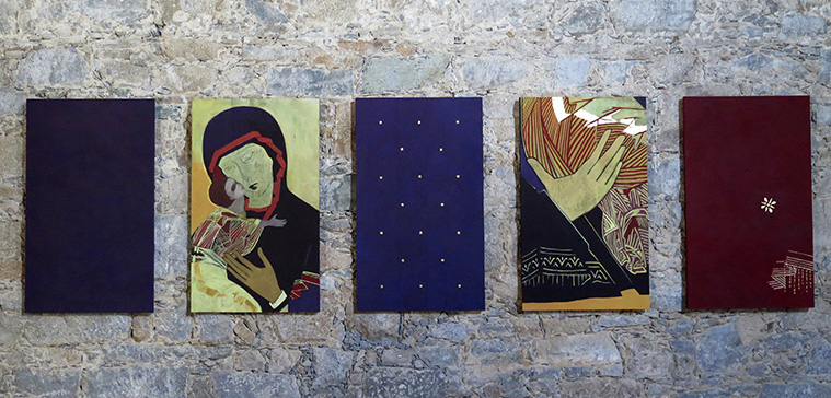
The Lady of Tenderness is a tempera-painting in five pieces, based on an ancient Russian icon, known as The Lady of Vladimir.
In the Capela Imaculada the ambience is clean, spacious and light – even a bit austere. In the chancel there is a strong interaction between the solid stone of the walls, the central light-opening from floor to ceiling and the stone, steel and moving water of the altar. The colour-element of the chancel needed to be congenial with this clean, strong, space, and also have the quality of fitting it into its proper context - the story of Mary and the Christ. One of the most classical and distinct images of this is the icon, and especially the icons of the Eleusa-tradition, i.e. the tradition of tenderness, where Mary tenderly holds her son close to her.
The Lady of Vladimir belongs to this tradition, and was chosen as a basis for the paintings because of her austere and pure beauty, typical of this early icon tradition. Her origin is obscure, but traced back to Bysantium – according to myth she is even thought to have been painted by the Evangelist Luke. In the 13th century she was brought to the city of Vladimir, where the Russian Prince Andrey had his court, and was named after the city. Her reputation for being able to perform miracles was great.
It has been interesting to see how this very old form-language could be translated into a modern one, with its meaning and content intact. The given space was a long-stretched rectangular, which gave the possibility of a series of paintings, and five were chosen. The colours are the basic ones of red, yellow and blue in many shades and hues. The technique is tempera, the oldest painting technique there is, and one much used in icon-painting – but also a technique valued and used in contemporary painting because of its superior ability of keeping the colours luminous and radiant in all the different lights of the day and over many years. The panels are made of linden wood, the traditional material used in icon-painting.
The first painting is a deep blue-violet space, with no other visual elements. It is the space that surrounds us, the space of God, the empty space of potential.
The second painting is Mary herself with the face of the Christ-child tenderly held close to her own. This tenderness, so central for the Christian message, is also the natural center of this work.
The third painting is the stars of heaven, the divine pattern surrounding and affecting us all.
The fourth painting is of Mary´s hand, holding her son, the strong and reliable hand of a mother, something to trust. The meaning of which calls for contemplation – naturally for all mothers, but also for all the rest of us.
The fifth painting is of one flower from the original painting. The vestment of Mary has two flowers, one placed on her forhead, and one over her heart. The one over her forhead indicates the importance and power of wisdom and intuition, the one over the heart the power and importance of love. The flower over the heart was chosen for this painting.
These paintings would like to remind us of the power of love and tenderness in this world of ours, with the inspiration from Mary as mother, in our contact with God, with our fellow human beings and all other beings.
Lisa Sigfridsson
painter
A Senhora da Ternura
pintura a têmpera
constante na capela-mor
da Capela Imaculada
Seminário Menor de Braga
A Senhora da Ternura é uma pintura a têmpera composta por cinco quadros e baseada num antigo ícone russo, conhecido como A Nossa Senhora de Vladimir.
Na Capela Imaculada a ambiência é pura, ampla e despojada – um pouco austera, até. Existe, na capela-mor, uma forte interacção entre a solidez das paredes de pedra, o feixe de luz central aberto desde o chão até ao tecto, e a pedra, o aço e a água em movimento do altar. O elemento de cor da capela-mor tinha de estar em conformidade com este espaço puro e forte, mas tinha, também, de ser capaz de o enquadrar no seu contexto: a história de Maria, mãe de Cristo. Esta imagem clássica e distinta tem sido transmitida sobretudo pelos ícones, especialmente os de tradição Eleousa, ou "Terna", da Misericórdia, em que Maria, ternamente, segura o seu Filho encostado a si.
A Nossa Senhora de Vladimir pertence a esta tradição, e foi escolhida como fundamento dos quadros, dada a sua beleza austera e pura, características desta representação iconográfica antiga. A sua origem é obscura, mas remonta a Bizâncio – considerando-se até que terá sido pintada pelo evangelista Lucas. No século XIII, terá sido levada para a cidade de Vladimir, fundada pelo príncipe russo Andrei Bogolyubskiy, e recebeu o nome da cidade. Era grande a sua reputação de milagrosa.
Foi muito interessante perceber como esta linguagem antiga pôde ser traduzida de forma moderna, mantendo intactos o seu significado e conteúdo. O espaço disponível consistia numa longa faixa rectangular, o que levou à execução de uma série de quadros, dos quais foram escolhidos cinco. As cores seleccionadas foram as básicas: vermelho, amarelo e azul, nas suas várias tonalidades e matizes. A técnica foi a têmpera: não só a mais antiga técnica de pintura, e a que é mais frequentemente usada na pintura dos ícones, mas também uma técnica que é especialmente valorizada na pintura contemporânea, dada a sua superior capacidade de manter a cor luminosa e radiante nas diferentes luzes do dia e por muitos anos. Os painéis foram feitos de madeira de tília, o material tradicionalmente usado na pintura dos ícones.
O primeiro quadro consiste num espaço azul-violeta escuro, sem qualquer outro elemento visual. Trata-se do espaço que nos rodeia, o lugar de Deus, o espaço do que existe em potência.
O segundo quadro é Maria com o rosto do Menino ternamente encostado ao seu. Esta ternura, fundamental para a mensagem cristã, é naturalmente o núcleo duro deste trabalho.
O terceiro quadro apresenta as estrelas do céu, o divino padrão que nos envolve e afecta a todos.
O quarto quadro é o da mão de Maria, que segura o seu Filho, a mão forte e segura de uma mãe; de todas, a mão em que mais confiamos. O seu significado requer contemplação – da parte de todas as mães, naturalmente, mas também de todos nós.
O quinto quadro apresenta uma flor do quadro original. O manto de Maria tem duas flores, uma colocada na fronte, outra sobre o coração. A da fronte indica a importância e o poder da sabedoria e da intuição; a do coração o poder e a importância do amor. Esta foi a flor escolhida para o quadro.
No seu conjunto, os quadros intentam recordar-nos do poder do amor e da ternura neste nosso mundo, a partir da inspiração de Maria, mãe, no nosso contacto com Deus, com os nossos irmãos humanos e todos os outros seres.
Lisa Sigfridsson
pintora